User Experience & User Interface
The Shocase prototype took shape in Peets Coffee. Fueled by caffeine and commeraderie, founder Ron Young and I collaborated on site concept and its look and feel.
Those scribbles and sketches became the prototypes that helped raise the seed money for the business idea to become a reality. With Ron’s hustle, and the talent and toil of the team listed in the right sidebar, those early ideas came to life. Shocase is about recognizing the people behind the brands—in this case, that ranges from designers to coders. Thanks gang.
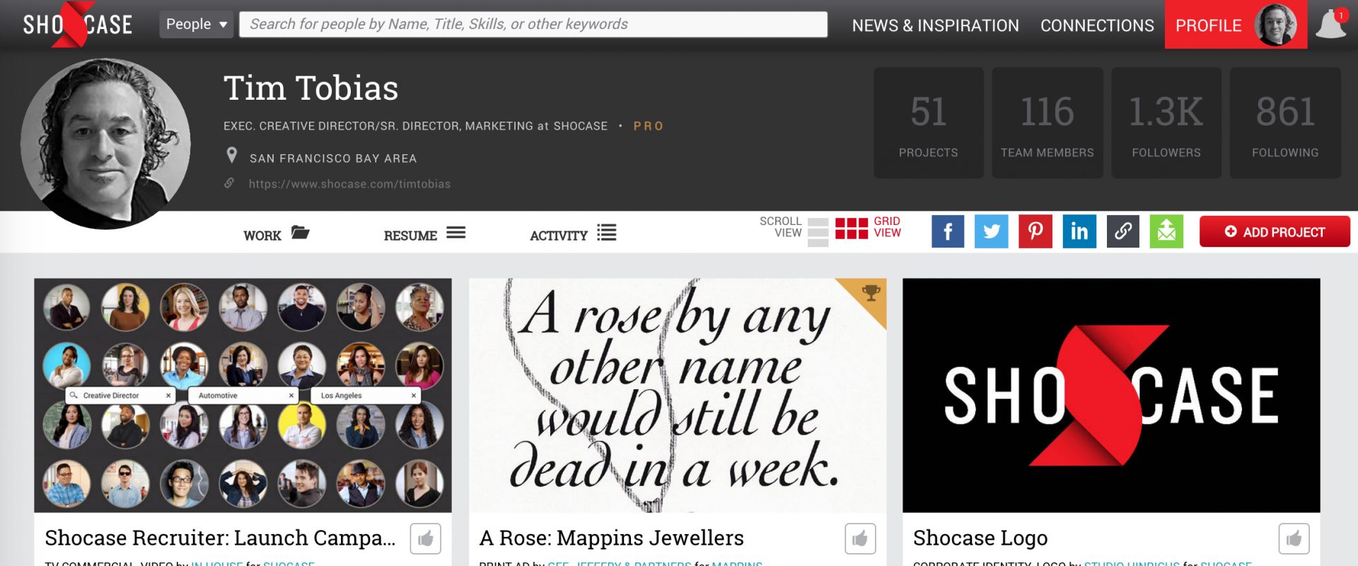
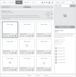
The header image above, is an example of a Shocase portfolio page — it just happens to be mine. To create your own–it would be great to have you there with me–join here. For a live example of my ux/ui experience check out my Shocase portfolio.
Wireframes to Working Pages
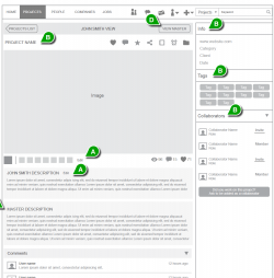
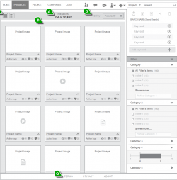
Shocase’s content—from newsfeed and member profiles, to company pages and job postings—were delivered online, and beyond responsive with a custom mobile experience. Prior to launching an MVP (minimum viable product) which leveraged a handful of page designs — we wireframed over 170 distinct pages. Those pages laid the blueprint for the development direction and expansion of the site’s offerings like the select pages below.
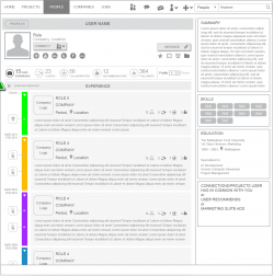
Visual Resume
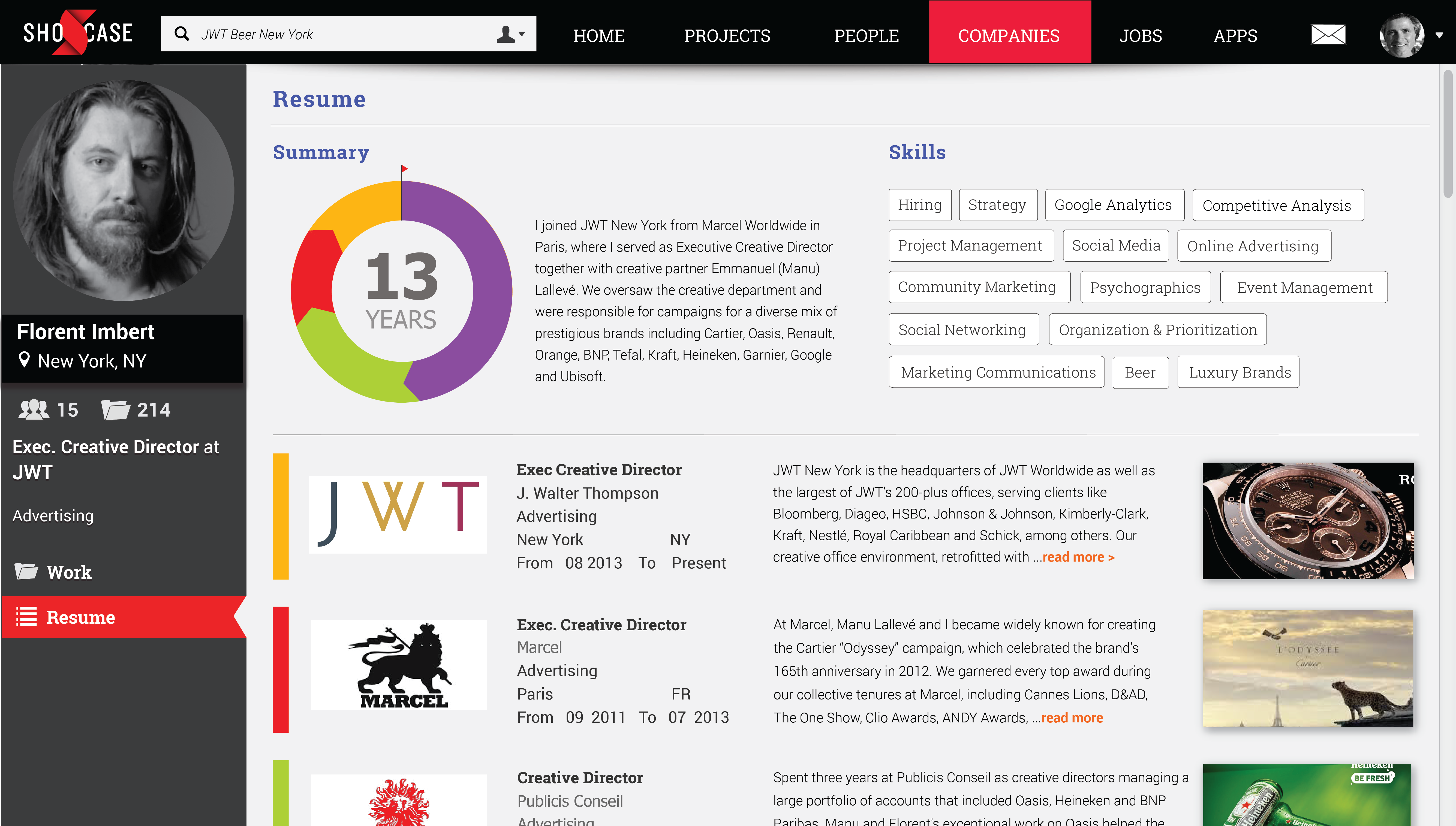
Bringing the plain-text resume to life. Making it easy to understand at a glance, yet rich enough to engage the viewer with samples of your work. (The yellow highlights seen below indicate the specific search keywords that brought the viewer to the page.)
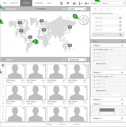
Geo Search
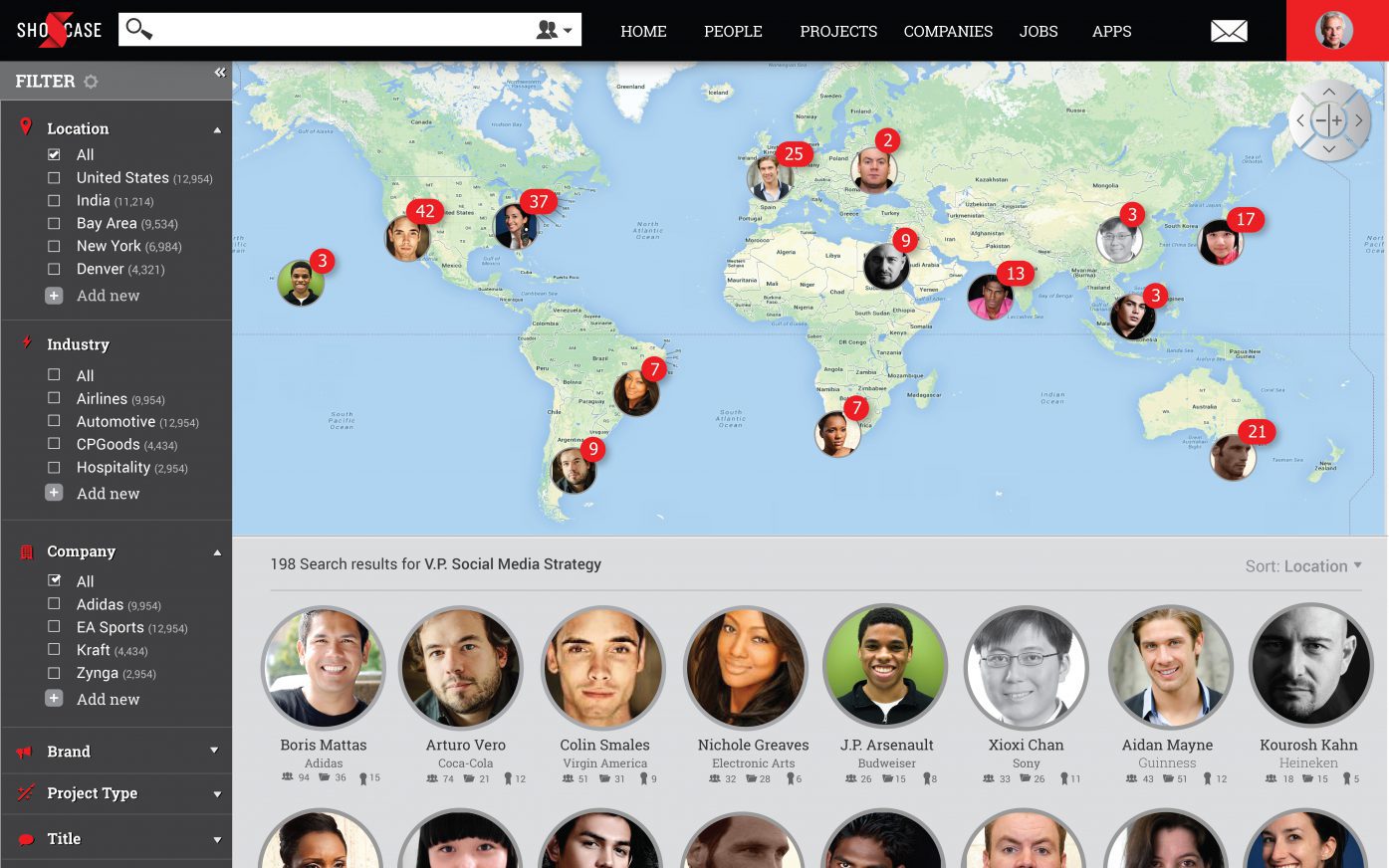
How far would you go to find the right person? Shocase Geographic Search was designed to help you discover where the right people are—around the corner, or around the world. In keeping with the Shocase look and feel, this powerful search tool is visually rich and tells the viewer a lot with just a glance.
Award Entry
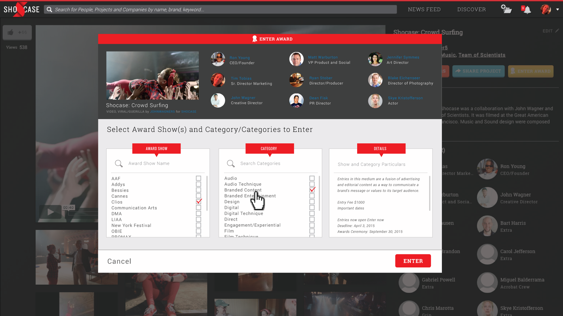
Entering awards can be a time sink—often requiring several people, and long hours to amass the required materials and contributor specifics. Since all that information is already available in Shocase’s database, submitting it to a show is much more efficient and effective.
Native App – Creating Communities Around Content
The following UX/UI design was developed as part of an exploration of how native smartphone apps could be used to help create digital communities around formerly print-only magazine content.
The project started by leveraging the existing editorial design of a given magazine (not at liberty to disclose) to create the ability to have social interaction around the magazine’s content (print, podcasts, streaming events). It went further by exploring potential directions that could be used in marketing the concept to other magazines. ‘Q-Concept’ is one example several developed during this design exploration. All concept studies explored from content feed, social interaction (likes/comments/shares) to user profile, and user-profile management.
Q-Concept


